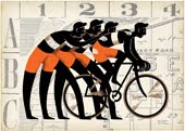
This was for a Reader's Digest publication, a story about a man's memories of a local store called Ingram's.
I was definitely thinking 'vintage poster' on this one...it's always interesting- the struggle between less and more,
flatness and form.


